Text Bubbles too Close to the Trim Line

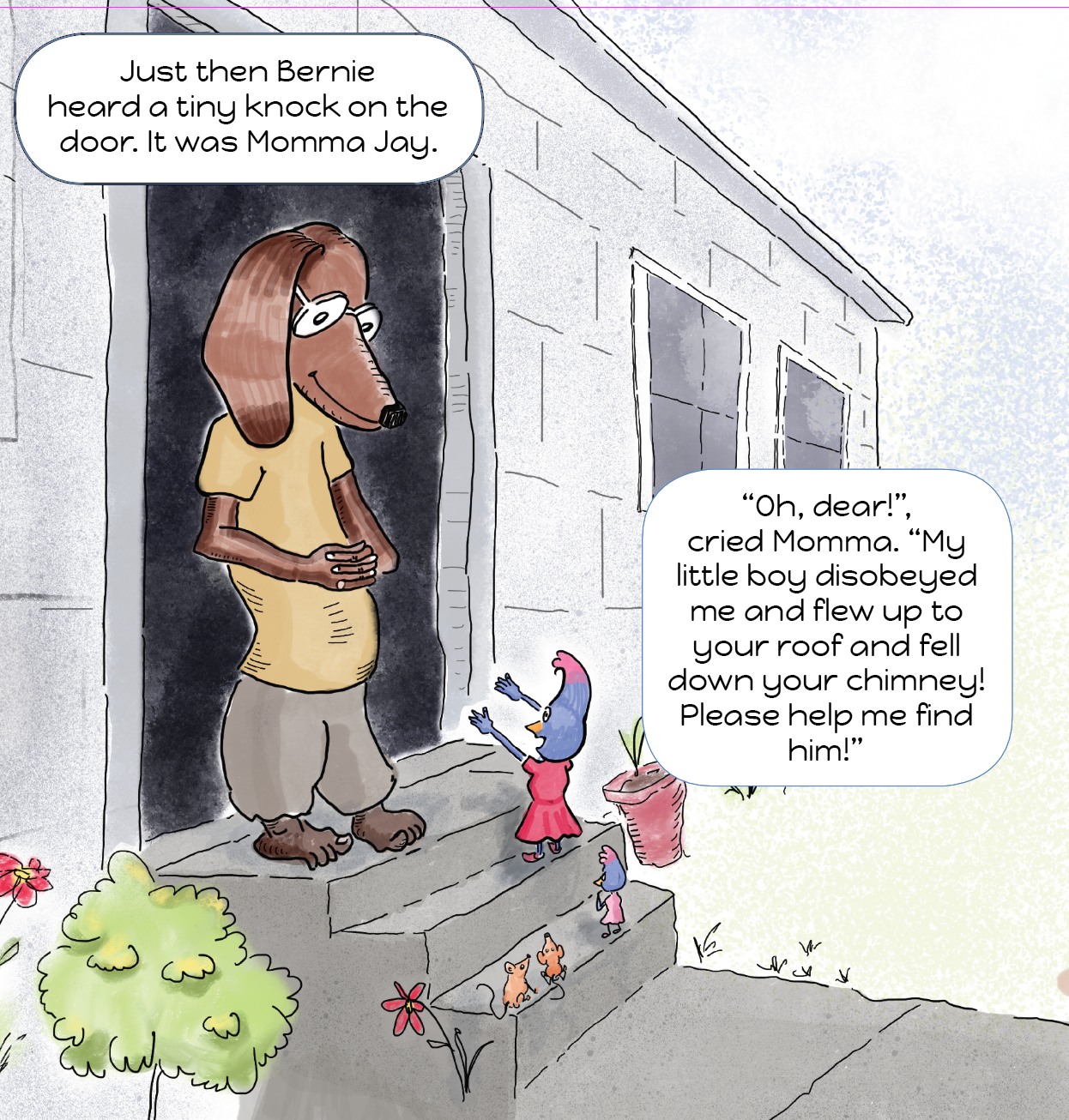
I moved another inch closer to the End today. I was double-checking the size of images — again — and, by accident, discovered that some text bubbles were running off the page, overflowing the trim line. Though I thought I had placed images and text boxes with mindful care, I really missed the mark. I’ve been looking at these pages for months without seeing that the text bubbles were too close to the page’s trim line…until I exported the book to a PDF and pored over each page pixel by pixel.

Here’s an example of what happens when I rely on the judgement of my eyeballs — on a single page there two text bubbles leaving the page and one in danger of becoming the third mistake if the trim line is shy by a millimeter or two. Three mistakes on a single page! Whoa!

bubble_too_close_to_cut_line_blog.png, text bubbles, cut line, InDesign

Removing the Black Stroke from All Text Boxes in InDesign

The more I looked at the black stroke around all of my story’s text boxes, the more I hated them. They were giving every page a disheveled, congested feeling. So, I decided to remove all strokes. I guessed InDesign, having every feature imaginable, would have a way to removed them all at once, and it does — but it will only work when the object’s stroke is the default stroke, not with any custom stroke that’s been applied after the text box was created. Custom strokes must be changed manually. So, I soldiered on and marched diligently through all 32 images and removed all of the strokes by hand. It took about an hour. The silver lining of this tedium is that I found a couple of typos and some text that had a white stroke that obscured some of the letters on the lines above and below. Altogether, it was a profitable day.

This image shows the text without the obnoxious black stroke.

no_stroke_blog.png InDesign, text frame, text box, removing stroke, default stroke


Alfresco Art Club Challenge, Sep 15, 2019 - Learn by Trying to Copy a Masterpiece (Edward Hopper)

Today’s art club challenge was, once again, to paint like a master. I chose Edward Hopper because I like his simple look…at least it appeared to me to be simple…until I tried it. Part of my personality is that I think everything I want to do will be easy. It’s because my ego is forever 6-years old and utterly convinced that I can do anything I put my mind to. I got that delusional notion from my mother, who told me many times during my childhood that I really could do anything. I found out she was dead wrong when I tried to learn how to play the classical guitar. But that’s another story.

Today I learned that a simple-looking masterpiece is not simple. I also learned that even though a masterpiece is pretty much impossible to copy, it’s worth doing. Just have a little talk with your ego, then swallow your pride and consider yourself a spectacular success at learning a few new tricks.

This painting is my rendition of the red-headed woman sitting at the counter in Edward Hopper’s Nighthawks (1942).

Keeping Colors Consistent Throughout the Book

Just as I feel ready to think about publishing, opened the book in InDesign and the first thing I noticed is that that Jimmy’s shirt is different colors in several images. I don’t even want to think about Jimmy’s apparent age being inconsisten from one page to another. I’ll work on these problems tomorrow, because today was Saturday, and that means it’s a chore day. As I usually do, I cooked up enough food to carry me through the next 4 or 5 days. I made a pots of three-bean chili, curried cauliflower soup, and delicious humus.

Back to Art. Here’s an example of the color inconsistency I mentioned earlier.

Loose Ends

Now that I have all of images in place — at the right resolution — and all of the text rewritten and polished, I have one more painting to create: a realistic Steller’s Jay and a Monarch butterfly. Beyond that, I will dive into the world of publishing my work. Being a self-published author has been a lifelong preoccupation, since I was ten-years old and I got a tiny printing press one Christmas. My dream was to publish my own newspaper and give it to my neighbors.

I haven’t done any painting this week…I’ve spent all of my time with my friend InDesign. The publication side of picture books is definitely not as much fun as the creating pictures side. Still, I want to get good at getting books published as quickly and painlessly as possible. Then I can move on to the next book.

No picture today.

Day Two of Rounded Text Bubbles

Today was a repeat of yesterday — making rounded text frames. I didn’t find a way to transform all of the text frames globally, so I edited them one by one. Boring work. I’m guessing there’s a quick way to make changes to all of the text frames at once, I don’t have the time to look for it. I’m ready to move on to the next phase of this book. Funny, but I don’t even know what that’s going to be yet. All I can think of at this moment rounded corners.

I do think the pages are looking more organic that the square rectangles. Here’s a screenshot of how the pages look in InDesign.

rounded_corners_blog.png InDesign, Rounded text frames, text bubbles, children's picture book

More of the Same but with Friendlier Rounded Text Bubbles

Today I spent my Art time in InDesign fine tuning the images and text. Several images were too low-res to be used for the print version of my book. I had to find the PSD files I used to create the PNGs, and increase the canvas size for several images. As usual I couldn’t find the original PSD files. That was a pain. Whiles was futzing around I got the feeling that the rectangular text boxes were a little to formal looking for a children’s book, even unfriendly. I started tinker with the border radius and ended up with .5 inches, which I think creates a curvaceous, inviting impression. Here’s an example.

text_frames_rounded_blog.png

A High Level View of My Children's Book

When I stitch together thumbnails of all of the pages in my children’s book, I get a global view of the entire project. I can see the overall flow of the story without considering the text, which is simply displayed as black bars. I realize now that I should have worked on this flow view right from the beginning. I did have a storyboard, but I see now that it’s a good idea to get the storyboard right before plunging in to drawing and painting. I’m going to live and learn…and do more work on the storyboard when I do the next book in this series.

Setting InDesign Paragraph Styles

Today I’ve been fussing with the text layout for my children’s picture book. Too many of the dialog/text boxes were impinging on images, giving the pages a crowded, disheveled look. To loosen things up with better spacing, I’m reducing the font size to 16 pt and center-aligning the text. It’s the most compact way to set the type. Since the paragraphs sometimes have only a few words, I reduced the leading, known as line-height in CSS, to 18pt, just enough that the descenders in the “g” don’t collide with the tall stems, the ascenders, of the “t” and “d” characters. The settings can be applied globally to all paragraphs in the Type -> Paragraph Styles dialog.

Here’s what my layout looks like now.

Al Fresco Art Club Challenge, Sep 8, 2019 -- Maneki-neko in Gouache

Today’s Al Fresco Art Club challenge was to do a still life in one hour. I chose to paint one of my maneki-nekos, a shiny black marvel with lots of highlights and reflections. I started with a sketch using a water soluble graphite pencil, then painted in the local color: black, then blocked in the other gold and green areas. By the time I had done that, my hour was almost up, so I painted some rushed highlights to give it a little more interest.