Choosing the Cover Image for My Children's Picture Book

I created some cover image thumbnails yesterday, and today my inch forward consists of flipping my favorite thumbnail horizontally. Sometimes and inch of progress is as slight as reversing an image, but I’ll take it. I’ll complete this image using pen and ink, scan it, then polish it up using my iPad and Procreate. It’s a hybrid process.

Of course, the text needs to be fixed and the bar code moved to the back of the book. Next step beyond having a cover image to pony up the money and ISBN number so I can fit my image into Ingramspark’s Cover Generator. Digression: What a baldfaced ripoff the ISBN system is. If’s an unholy deal with the devil.

Sketching Ideas for a Cover Page WIthout Knowing What's Expected by the Publisher

Since I don’t have an ISBN number for my book, I can’t use Ingramspark’s Cover Generator to make a template that can be used to plan a cover image. So…I’m just going to look at some books and make a cover. I’m using Maurice Sendak’s Where the WIld Things Are as my model. I know I’ll need some text for the title, author name (Doukat!), the image itself, a barcode, and some room for the spine. My book has 40 pages, not thick enough to print the name of the book, so the cover image will simply wrap around to the back cover. I’m probably missing some significant details, but I’ll add them in when I have access to the Cover Generator.

I pulled out my project sketchbook, which I haven’t used in 8 months, and did some quick sketches that show the front and back covers as one extended image. There’s one example that uses two separate images, one for the back and a family group picture for the back. I lettered in a rough title and place a mock barcode on the back. In one case my brain got twisted around and I drew the barcode on the front.

After months of drawing digitally, working with paper and pencil felt like coming home. There’s no icon telling me that I have a low battery, no layers, no crazy multiplicity of brushes. Just paper and marking tool.

I’m going to turn one of these sketches into a cover. See if you can guess which one.

Al Fresco Art Club Challenge for Sep 29, 2019: Paint a Common Object, Like a Camera

I was in charge of choosing today’s Al Fresco Art Club challenge. I thought that painting a common object that had simple rectangular shapes, such as a camera, would be something I could easily do. In fact, it would be so easy that I might as well paint two cameras. I chose a Polaroid camera and a Diana Mini.

I dashed off a sketch and painted in the background using some dried paint from last week’s challenge, then blocked in the cameras. About 15 minutes into the hour, I came to my senses — I would have time to paint only the Polaroid — the Diana Mini would have to sit there on the page, an unfinished skeleton, like one of those sketches you might see in the margin of Leonardo da Vinci’s notebook. Future art historians will have a field day with my humble painting.

polaroid_al_fresco_blog.png Al Fresco Art Club, Polaroid, Diana Mini Camera, gouache

Chore Day, 9/28/2019 - Cooking, Doing Linuxy Things, and Pondering Cover Pages

Most of today’s pondering has been about my children’s book cover art. I thought it would be a good idea to check the Web for some helpful tips. First I went to Ingramspark.com to look at their Cover Page Generator. Sorry, but you need an ISBN to use that “free” tool. I don’t have an ISBN number yet, so I tried a general search “DIY self-publish cover page template tutorial”. There were 23,000,000 results, which means there must be a lot of DIY self-publishers looking for answers and lots of Web Entrepreneurs ready to provide them. As I expected, all of the links on the first page of results were just ads for miraculous solutions to the cover page problem. Sometimes the WWW is just a pile of garbage and I’m feel like searching for the little piece of real information buried under a dung heap hype.

In the end I decided that I will simply look at an admirable children’s picture book and learn from it. I’m going to use Where the Wild Things Are as my model. It has 50 pages, not counting the cover. I’ll have 40 pages, which means that I won’t have enough pages to print the name of the book on the spine. Here’s what Ingramspark says:

Spine Type Safety: For page counts below 48, spine text is not available. Spines 0.35” and larger – 0.0625” (2mm) left/right sides. Spines smaller than 0.35” – 0.03125” (1mm) left/right sides.

InDesign Children's Book JPEGs and PNGs Replaced with PSD Files

Now that I know better, I’ll be using only the original PSD files for my future children’s picture books. Live and learn, I say…when I’m feeling philosophical. Today I finished finding and replacing all of the low-res images in my children’s book. Hooray for me! My next step is to create the cover, which is no small task. Besides being the cover picture, there’s a back picture, and a spine, and the inner front and back liner content. I’ve read thousands of books, and yet, this is the first time I’ve even thought about what goes in to creating a book cover.

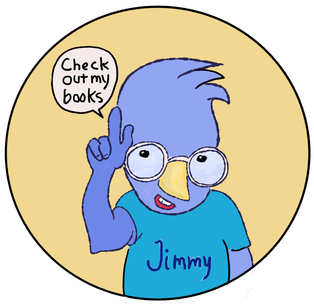
Here’s one of the images I patched up today. Just look at those cute bugs and rodents. My question is, why the hell is Jimmy’s nose blue? Shouldn’t it be orange, the same as it is in every other picture in the book? Dear, dear…that problem goes on to my ever-growing TODO list.

Day #256 Children's Picture Book Progress Report

Today’s progress was two low-res PNG images replaced by two high-res PSDs. By “low-res”, I mean having fewer than 3,200 pixels in either height or width. Print images have to be at least 300 dpi. For an 8” square page, that’s a minimum of 2,400 pixels, but to be safe, I’m going for a much larger size.

Picking the right size for digital images is important. Pick too few pixels and you limit your options to small pictures. With 300 dpi being the minimum acceptable resolution for print, you have to plan ahead, which I didn’t do. An 8-inch square image would have to be 2400x2400 px, not including the part of the picture extending to the bleed line. That’s an extra 80+ pixels of height and width. To be truly safe I should have created all of the images as 8000x8000 pixels so that I could use the images for something large, like a big poster. For my next book I’ll be doing all of the art using traditional media: pen, ink, gouache, watercolor, etc. I’ll be able to scan the images at up to 1600 dpi if I have to.

Here are the two images I replaced today: The first image was only 2000px tall. The second was only 1000x1000 pixels. Both images looked great on my screen in InDesign, but the would suck when printed.

This image was only 2000px in height.

The second image has a problem with body parts being so close to the trim line that they could be cut. That’s an unpleasant sight! The biggest problem is the sliver of white stabbing Jimmy in the back down in the lower right corner. I’m going to fix that by extending his shirt beyond the trim line.

This is Getting Repetitious but It's Part of the Self-Publishing Business

Today was like yesterday — I replaced another low-res jPEG with the full-sized PSD file. Okay, I’ve learned my lesson. Enough! Let’s move on!

That’s what the impatient part of me is saying, the part that quits a project when it gets tedious/repetitious/grueling/hard. I’m talking to myself when I say, I ain’t falling for that line of reasoning. I’m going to ignore the noisy propaganda coming from inside my own brain and focus on getting this project repaired and completed. One inch at a time still stands as my guiding principle.

Here’s the image I replaced today. Because I’m displaying it on a web page, the resolution looks fine, but it’s way too low for printing. What looks good on a web screen looks like crap on paper. This image is for the square print version of my book. I’m planning to use a 4:3 aspect ration for all images in my next book. It’s a decent compromise — there will be reasonable black bars on HD devices, but it will be perfection for print and the iPad.

Ditto, Ditto, Ditto

Today’s inch forward is the same as yesterday’s inch forward — I replaced two low-res JPEGs with their high-res original PSD files. So, I really moved two inches forward today.

I calculate that by the time I walk the miles required to get this book done, I’ll need to make more than 63,360 inches of progress. At my current rate of two inches a day, completing this book will take only 31,680 days, and that’s only 86.79 years. Furthermore, by the time I finish my proposed series of six Jimmy Jay and Buddy Butterfly books, I’ll be only 521-years old. I’m not deterred even though Art truly is long, and Life, no matter how long, is always going to be short. The silver lining is that Art will always be there waiting for me, incomplete, mysterious, alluring, and never boring.

In the meantime, I thought this Github Kitty Kat might be an amusing diversion from the facts of life.

More of the Same, Again...Replacing Low-res Images, That is

Today I spent most of my Art time trying to get my Plustek A3 scanner working with Linux…so far it’s a no-go. It turns out that Linux can’t deal with certain scanners because of hardware incompatibilities. And, Plustek is one of those corporations that doesn’t care about Linux. With that in mind, I tried using Virtualbox to install Windows, which does work with my scanner. I planned to open a Windows session (in Linux) and use my scanner as I would use it with Windows. But, alas! Virtualbox doesn’t want to recognize my USB ports. I’m optimistic that I’ll eventually find a very technical solution. I have to remind myself that there are some tasks that are much harder — and sometime impossible — with free software.

In the meantime, I spent my remaing Art time tracking down low-res images in my InDesign document. This is the single image I replaced today. As I’ve said before, and inch a day keeps the fire burning.

Al Fresco Art Club Challenge - Sep 22, 2019: Learning to Paint Basic Shapes with Gouache

At today’s Al Fresco Art Club meeting I proposed that we all paint a common object using basic shapes — all in one hour. In previous challenges attempting to replicate masterpieces was instructive, and fun. Those challenges taught me that I should really learn the basics first if I want to develop confident brush strokes. As it is, I usually worry the poor paper to death with a thousand tiny pecks of the brush.

I chose to paint my Holga 120 N film camera atop an Artbin craft box. I assert that the black blob does resemble a camera, and the plastic bin definitely look something like an Artbin bin. In this exercise I learned that it’s a good idea to paint in the background first. I didn’t this time but I wish I had. This is called learning from experience.