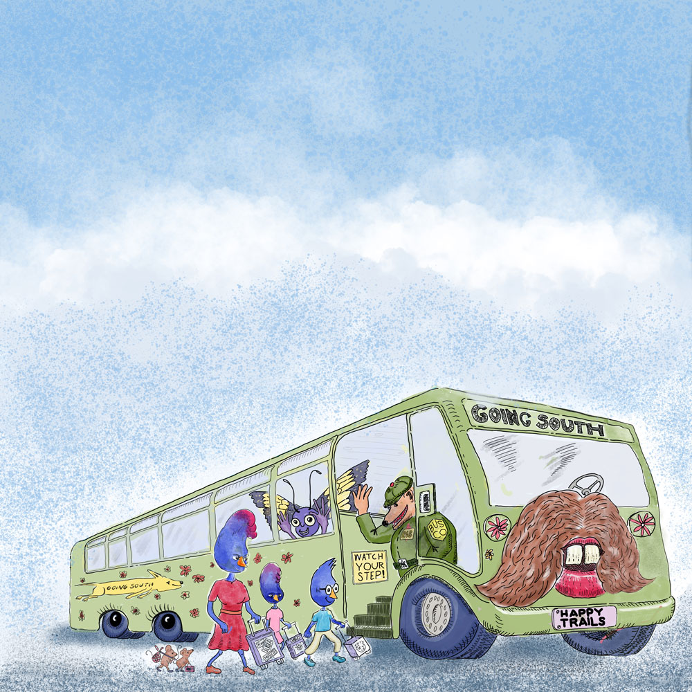
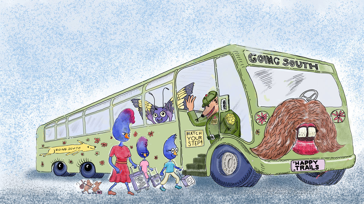
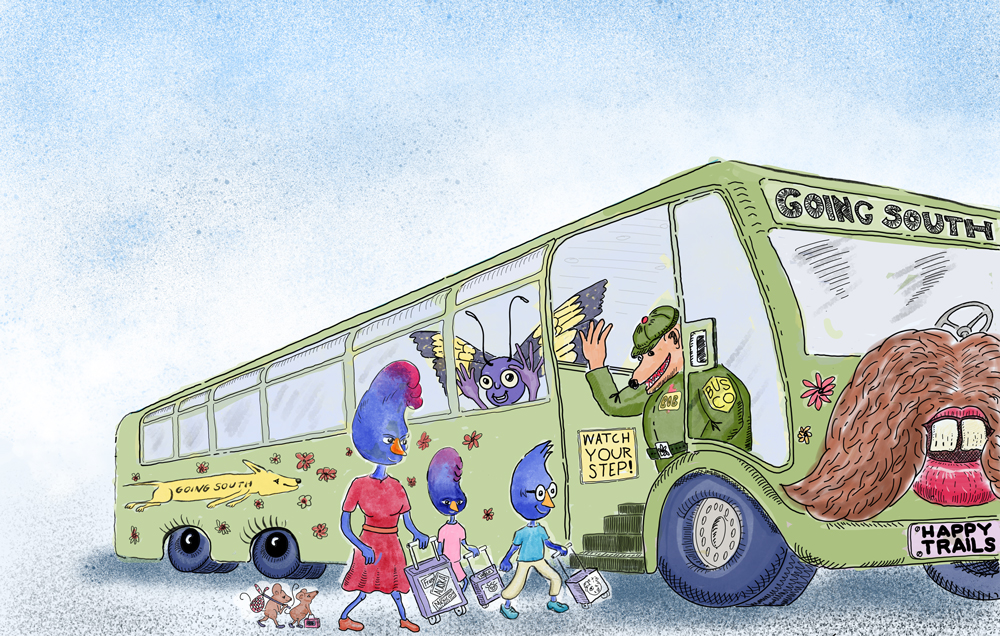
Another image in need of repair

Today was a back-to-the-day-job day. I got off work late, but I had time to start repairing an image that has the wrong proportions for my square print book. I didn’t account for the bleed. As a result, legs are cut off, the sun will be cut in half; the chimney gets whacked, and more.

I created this image in Procreate and I’m having a hell of a time fixing it. My impatience is affecting my attitude. I was hoping that I’d have time today to do another gouache painting, but that didn’t work out. However, it’s important to me that I do something on my children’s picture book project every day, no matter what other unforeseeable detours I run into. The way I see it, an inch a day is an admirable accomplishment.

The canvas size of this image needs to be expanded to the bleed lines.

The canvas size of this image needs to be expanded to the bleed lines.

Al Fresco Art Club Aug 25, 2019 -- Gouache Painting of the Siskyou Mountains from Memory

Today’s art club challenge was to paint anything using gouache. I’ve been shying away from gouache for years, but now the look has great appeal, and I find that I can’t get the look digitally. I want to give gouache a try in my future children’s books and I know the most reasonable way to get the look is to use the real stuff.

I bought scant palette of seven colors: cadmium red and red light, cobalt blue, cadmium yellow, yellow ochre, and cadmium orange, as well as some titanium white and zinc white. I painted the view of the Siskiyou Mountains, as I see them from my back yard, from memory. I was going for a purple haze for the atmospheric perspective, but I wasn’t able to mix the color I wanted. I see now that I was on the right track, but I could have mixed in more white.

When the painting hour was over, I felt that I’d broken some long standing ice. I liked my painting. My dread of real painting with real paint was lifted. I could see that my fear of creating an ugly painting had kept me from taking the plunge. Fear is such a waste of time.

Chore Day, Aug 24, 2019 -- Bean and Sweet Potato Burgers, Humus, and Curried Cauliflower

The bean and sweet potato burgers were for my furry friends. As for the humus and curried cauliflower, I’m happy with the recipes I’m using, but I doubled the spices. I have a deep appreciation for hot, spicy food.

I spent about four hours cooking. Usually I listen to hair metal bands — Poison, Motley Crue, Quiet Riot, and so on — but today I propped my iPad propped on the kitchen table so I cold binge watch Jame Gurney’s water color and gouache Youtube videos. That guy is amazing. He’s the Leonardo da Vinci of DIY for art, illustration, and painting. And dinosaurs.

No picture today. Ran out of time.

Out and About in Southern Oregon

I was out of the house most of today. When I got home I spent an hour in InDesign rearranging images to tighten up the flow of the story. I even removed a page, which hurt a bit because I have lavished a lot of time and love on that picture. But, I have a 32-page limit to stick to. It hurts to lose the one you love.

While I was in Medford I went to our amazingly well-stocked art store, Central Art Supply. Considering that we’re in the middle of Nowhere — 400 miles are from Portland or San Francisco — Central Art has a full line of Winsor and Newton, Holbein, and Daniel Smith water colors, Copic markers, Arches and Fabriano paper. And, prices are competitive with the big online vendors. I’ve made a pact with myself to buy all of my art supplies at Central. I really want to do my part to support their business. It’s fun to go into a brick and mortar store and touch the goodies.

I bought some gouache and a couple of water brushes. I’m preparing to learn how to paint with real paint.

Another day, and other page of my children's picture book

Here’s another example of an image that works in both the 16:9 e-book aspect ratio and as a square for the print version of my book.

I call this 16:9, but when I measured it, I found that it’s really 16:10. I’ll expand the image in InDesign to fit into the e-book template. When expanding images it’s important to have a sufficiently high resolution that the expanded image doesn’t drop below 300 dpi. When that happens Ingramspark will reject the upload. It’s a good idea to work with 400 or 600 dpi images just in case you have to do something funky.

The e-book version of the page…

The square print version… Note the white margin on the left of the page. That margin is on the side that attaches to the spine. It’s on the left for odd numbered pages and on the right side for even numbered pages.

Preview of Children's Picture Book in Kindle E-Reader

Kindle Create can show a preview what an e-book will look like in a a tablet, smartphone, or Kindle E-Reader. The E-Reader has a grayscale display, so my pictures will be viewed in all of their black and white glory.

The question is, why am I spending time with an e-reader when my goal is to publish the print version first? There are several reasons. The first is that Kindle Create converts the InDesign PDF into a series of pages that are fun to scroll through. I can also see which images can be easily adapted to a future e-book, and which will need more work. This particular image works with both the square print format or the HD e-book format, though the position of the text will have to be tweaked.

The original image without text…

The page, with text, as it will appear when viewed with a Kindle E-Reader…

More E-BOOK Image Shenanigans

Yesterday I showed a square image that I plan to crop for use into a 16:9 aspect ratio e-book image.. Today, I’ll show an HD aspect ratio image that I’m going to crop into a square image for my print book. This image, when finished, will have unimportant details on the left side of the image. I’ll be putting text there.

The colors are off in this image, way too saturated…I’ll have to work on that. Several other images have the same problem. Every time I tweaked this image, the colors got darker as I hurried to meet my deadline.

The light cyan border shows the HD aspect ration of the e-book version. The dark cyan border shows how the image will be cropped for the print version.

The light cyan border shows the HD aspect ration of the e-book version. The dark cyan border shows how the image will be cropped for the print version.

Creating an Image Usable for Both Print and Ebook

My ongoing dilemma is that my print book will be in a square format and the ebook will be in either a 16:9 aspect ratio (HD) or a 4:3 aspect ratio (iPad). In short, I need two versions of each image. I didn’t plan for dealing with screen aspect ratios when I started this book. I was impatient to get all of my images painted and just plowed ahead without thinking.

My solution for this dilemma, for this book at least, is to produce square images that can be cropped to work in either the iPad or HD format. I plan to crop the square image into a wide image suitable for an ebook.

The example below shows a typical square image. Notice that there’s a lot of headroom that contains no important content. I’ll place the text boxes in that space. In the cropped ebook version, I’ll place the text on the left side of the image, or the right side, depending on the placement of the action. I will have to make sure that no important characters or action is covered by the text.

Here’s the square version of everyone getting on the Magic Moustache Bus. As I said, there’s a lot of blue sky in this image.

2019_02_04_all_aboard_color8x8.jpg children's picture book, magic moustache bus, the Jay family

With the sky cropped, we have the wide ebook version.

2019_02_04_all_aboard_color16x9.jpg

Here’s what the original image looked like. When I drew this image I the bus became so large that it didn’t fit on the page. The new version shows the entire bus.

2019_02_04_all_aboard_color_original.jpg original version

Al Fresco Art Club Challenge, Aug 18, 2019 -- Another Cézanne Masterpiece

The Al Fresco Art Club is in a sweet groove. For the last couple of months the challenge has been to paint in the style of the masters, as if we were students trying to learn by copying a painting in a museum. I’m hooked on Cézanne. This week I decided to attempt to paint one of his more colorful portraits, Woman with a coffee pot. We’re allowed one hour to paint. Having a strict time limit encourages looking at a painting and quickly prioritizing the important details that must be in the final work.

As always, our painting had to be done on one layer, with no undo, no filters, and no gradients. I chose a triad color palette, which I created with Krita’s Artistic Palette and Gamut Masks tools. Very cool!

The gamut mask for Woman with a coffee pot…

Cézanne’s Woman with a Coffee Pot

Cézanne’s Woman with a Coffee Pot

Created with the Krita Gamut Masks tool

Created with the Krita Gamut Masks tool

My attempt…

Chore day, Aug 17, 2019...Krita, Krita, Krita

Today was chore day. Once again I spent the morning cooking up some chow for my Pug. Besides that, I had a few moments to ponder my future with Krita. I’ve noticed that whenever I sit down to explore Krita, I realize that there’s a lot to learn before I’ll be competent with it. The thought of learning something new, as I’ve mentioned before, causes me great weariness and lethargy. Even dread. I do realize that learning something new is hard. It’s not Krita that’s hard; it’s familiar territory, pretty much like other drawing applications. What’s hard is actually doing digital painting. It’s all new to me. I’ve watch hundreds of painting videos, but now I’m actually trying to make my own painting. My plan is to find a really basic painting tutorial and start by drawing spheres, boxes, pyramids, and cylinders.

The image below shows what I can do now. BTW, this is the second painting I’ve attempted with Krita. I’m going to stop counting now.