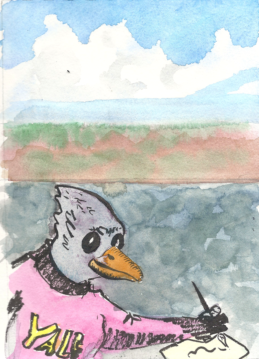
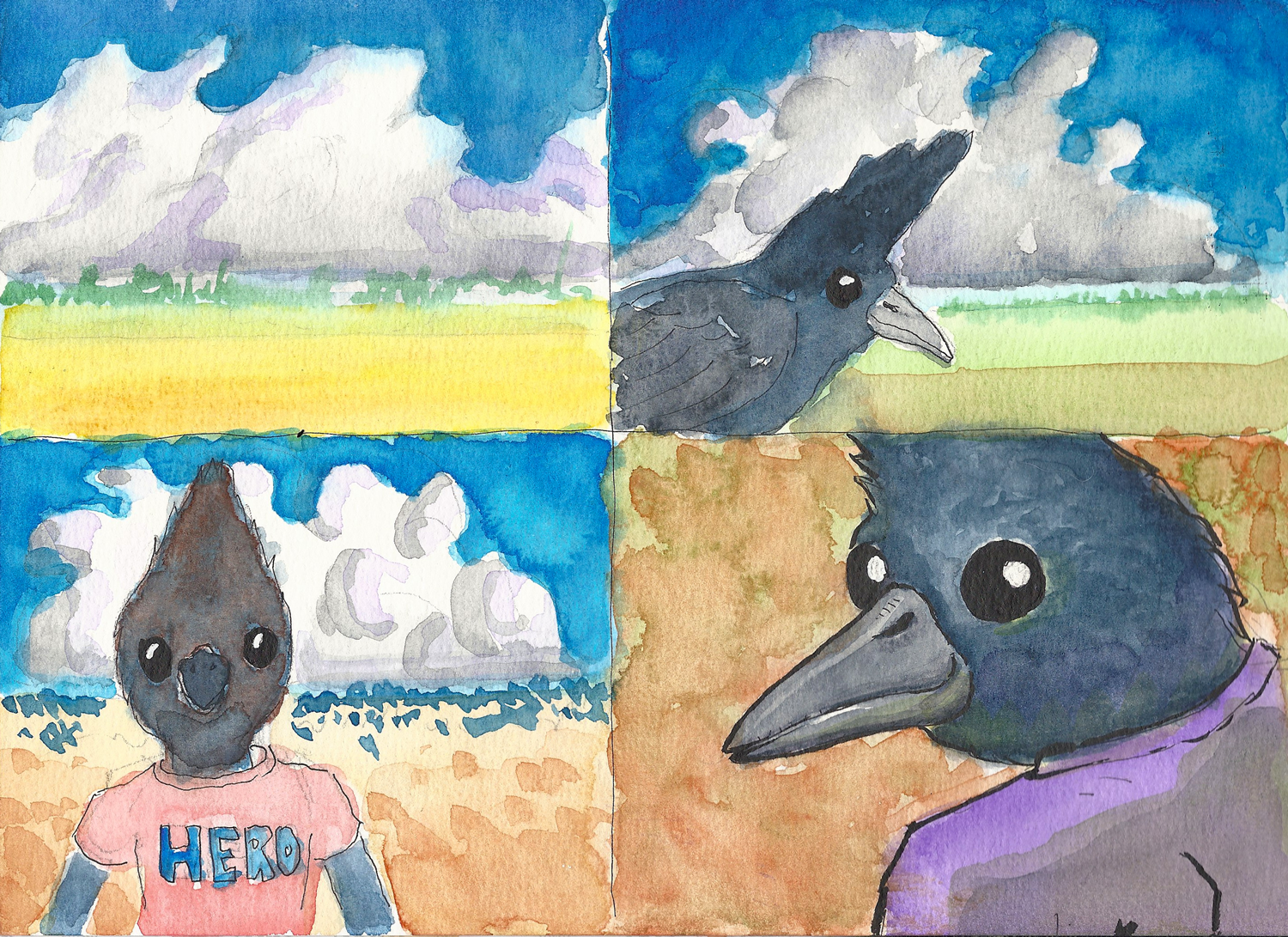
Clear line anyone? Ecoline?

I’ve been reading about Hergé today and ligne claire. So I got out my Pentel Pocket Brush and my Ecoline watercolors and had at it. I learned one more time that things that look easy are hard. My 10,000 hours of practice have just begun. I figure that with 2 hours a day to practice at the end of the year I’ll have 730 hours. Nice. Only 9,170 hours to go before I can lay down a real clear line. Fortunately, I’m a patient and persistent man, and I’m happy just to be playing with paint, paper, and ink.

Today’s work. Oh, by the way, I’m going to be posting my daily projects for 365 days straight. Why? Because I signed a contract to move forward at least one inch a day. I’ll have to post that contract some day.
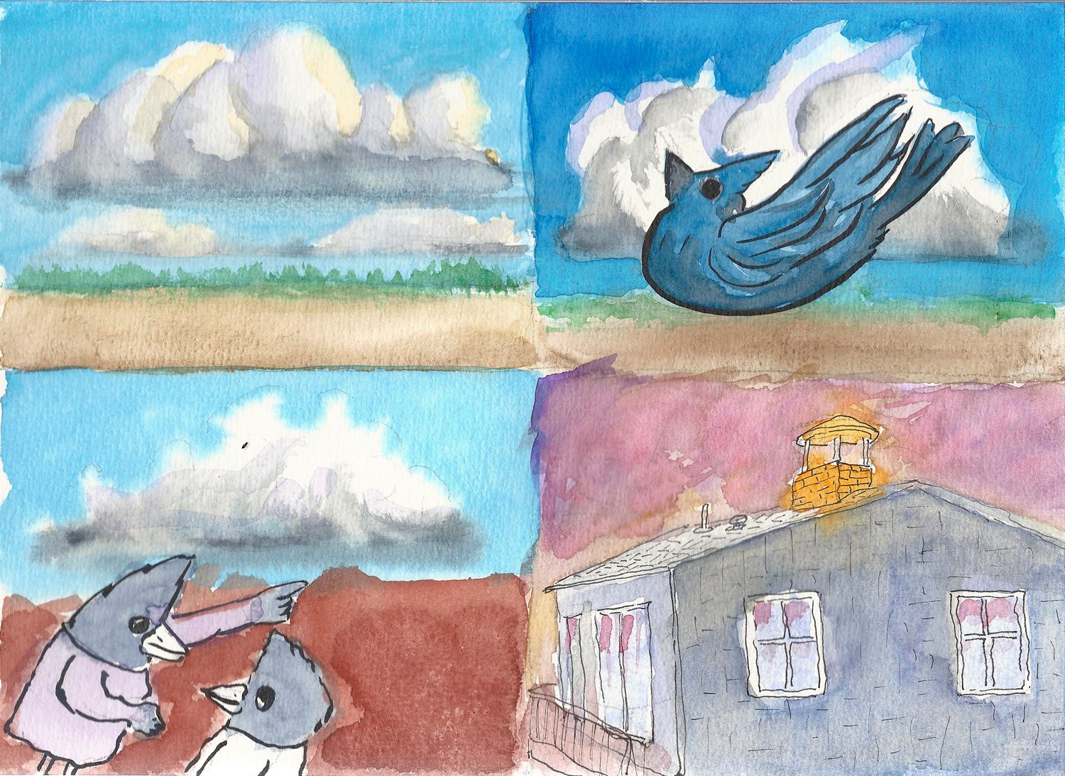
Redo with lightbox, pen and ink, & watercolor

Today my commitment to myself was to get out the light box and pencil trace yesterday’s watercolor of the jay in the chimney, ink it, then transfer the image to watercolor paper using the lightbox. I then dressed the inked watercolor paper up with watercolor. After all this old-school processing, I digitized the watercolor painting by scanning it and importing it into Photoshop.

Here’s how it turned out. The dark background was added in Photoshop.

One more thing… I’m signing all of my images now on the off chance that any images posted in Pinterest will give interested folks a way to find the original source, doukat.com.

More cloud practice and a character drawing

I’m working on my clouds again. Enough said about that. Today I practiced going into the wet and erasing the blue. I saw this technique on the ArtTutor Youtube channel.

Erasing the blue is far easier than protecting the whites.

For some reason painting this single cloud was very tiring, so I decided that I should reward myself by drawing a jaybird about to fall down our chimney. Every Fall one of these little guys seems to think it’s a good idea to go down our narrow chimney pipe to do some exploring. The trouble starts once they’re in the chimney and then find out and they can’t open their wings to fly out. They end up clattering around inside the damper, and then the soot up the living room when we open it and set them free. They last guy couldn’t figure out that the front door was wide open for him so he sat on the curtain rod of an hour or two then left without even saying “thank you.”

Down he goes.

A touch of Hergé

Barnes and Noble lured me into their trap again, this time with a 20% discount coupon. I was in Medford to go shopping at TJ’s, where I bought 12 cubes of Kerry Gold butter to my keto diet. After a quick trip to Chipotle, I casually dropped in to the local B&N to look around. And I bought Tintin: Hergé’s Masterpiece. What a guy Hergé was, except for his passivity during the nazi occupation of Brussels. Besides being the master of the Belgian ligne claire, he was an agnostic Taoist-Buddhist. That makes him a member of my tribe. Except for the clean line, which I’m still working on.

My homage is 100% derivative and respectful, drawn with my trusty Pentel brush pen and painted with my faithful Daniel Smith watercolors, all of it cleaned up in Photoshop.

Here you see that I’ve got my jaybird disguised as Tintin. When you see him sweating he’s usually running to a fight or running away from someone villainous who wants to do him in with a long, curved sword.


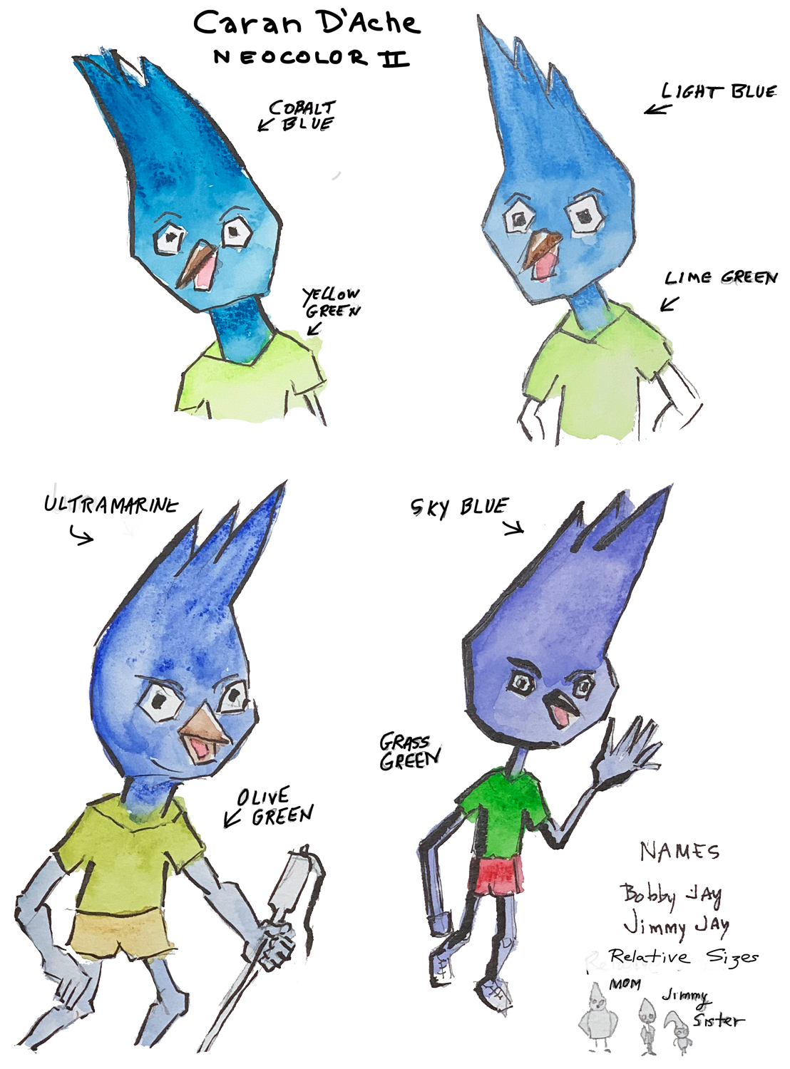
Caran D'Ache Neocolor II water-soluble wax pastels as watercolor

I’ve bought a lot of art supplies in the last 2 years. Yesterday I pulled my Caran D’Ache Neocolor II water-soluble was pastels out of the pantry. There are 40 colors in this set. The larger 84-color set is great, too — it just costs more.

Recently I’ve noticed that I’m feeling some frustration with watercolors. Then I got to thinking that applying color with wax pastels and adding water would be a quick-and-easy way to color characters. These wax pastels are artist’s quality and lay down considerable pigment. They wet easily and can produce deep, saturated colors.

For small figures I can see them working fine, but if I have to mix colors, maybe they’re an awkward solution. And I don’t see them as practical for big washes. Those gotchas aside, I think they look really good.

Caran D'ache neocolor II was pastels used for watercolor

Character sketches

After going through The Simpson Handbook, I realized how completely undecided I am about what my bird family should look like. The pros over at the Simpsons have every detail of their characters codified in a look-book. To do my children’s book right I’ve got to standardize my characters so they’ll look the same on page 28 as they do on page one.

So many decisions to make… Should birds have hands? If so, how many fingers on a hand? Five? Four? Should they have mouths or beaks? The can fly, so should they have wings or arms? If they have wings, should the wings be able function like hands? For example, should Momma bird be able to point a finger towards the chimney and say “Don’t you ever mess around with that chimney!”

Here’s are some drawings I did today —- a character sketch showing the relative sizes and color palettes for the Jay family, Momma Jay, Jimmy Jay, and Sammy Jay. Creating a look-book is right there on my mind map for this project, so today I can say that moved forward another inch.

But… now that I’m looking at Jimmy, I’m thinking he needs to be a little more endearing if he’s going to be the hero of the story.

Real cheap but okay watercolor paint set

I bought the U.S. Art Supply 36 color watercolor pan set for $7.99. I thought it was charming. I could look at every color and know exactly what color it would be when I painted with it. On the other hand, artist quality paint like Daniel Smith yellow ochre ($10.46) is so pigment rich that most colors are unidentifiable in the palette — I need a color card just to know what the colors are.

The U.S. Art Supply watercolor pan set claims to be safe for ages 3 to infinity, so I feel that I’m their target customer. By the way, there are lots of vendors selling this product under various branding and prices. I looked around and bought the cheapest.

UPDATE: It turns out that these cheap paints are abrasive enough to chew up synthetic brushes. Once again a truism is proven to be true: you get what you pay for. Caveat emptor!

The colors are a little intensified by my scanner, and Photoshop’s wonderful multiply mode. Even without enhancement, the colors look good to my eye.

Learning to paint clouds with watercolor

I’m practicing with my watercolors daily. In fact, I’ve got a signed contract in front of me that says I’ve agreed to practice watercolor 365 consecutive days. I signed the contract in blood. Actually, I didn’t use blood — I used my Muji 0.38mm gel pen.

I want my children’s book illustration to have cute clouds, so that’s what I’m practicing. I’ve already learned that opaque colors aren’t going to work with pen and ink drawings. I’m using Winsor and Newton Cotman watercolor for these paintings, and the reds are mostly cadmiums.

And I’ve learned that I’m one impatient guy, and when I get impatient, I try to force the paint onto the page. So, in addition to practicing watercolor painting I’m now practicing being patient. It seems that I’m going to be a very admirable person by December 2019.

I have another watercolor palette filled with Daniel Smith watercolor, all transparent. I going to switch to it when I do tomorrow’s exercises.

Here are my first efforts.